Charts were the first graphical feature we introduced in chipmunk. Using them will allow you to get a quick overview of the data you need to analyze.
Data with a chart
In an example we used chipmunks command-plugin to repeatedly execute the top command:
top -s 5 | rg "Load|CPU\susage|Networks|Disks"
We applied a chart-search-expression to the data, once to extract the CPU usage and once to extract the Load average.
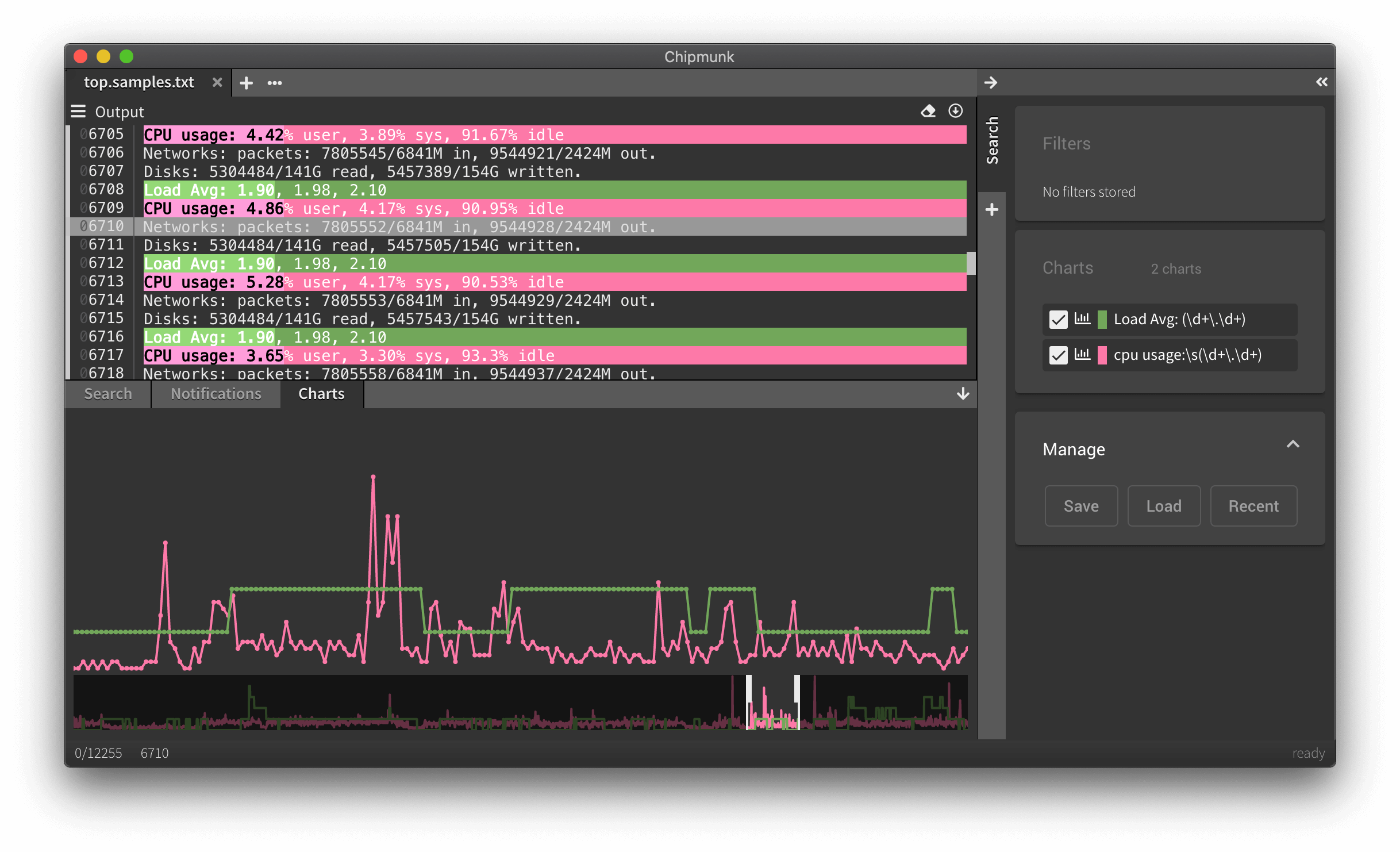
Details for individual charts
While we think this is already immensely powerful, the charts feature gained a very important detail with the latest release: charts can now show you the scale of the data they depict, depending on which of the graphs is selected. In the images below, we respectively selected the green and the pink graph.
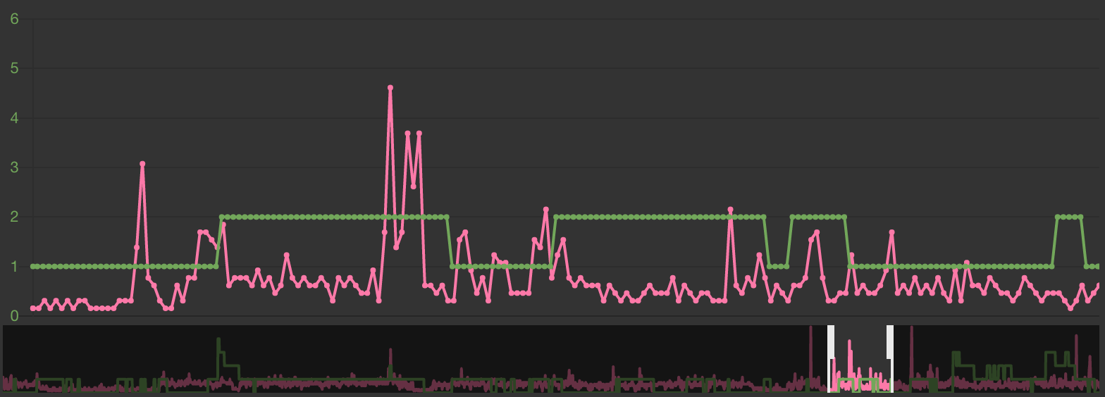
It’s now easy to see at a glance that the load was always between 1 and 2 percent.
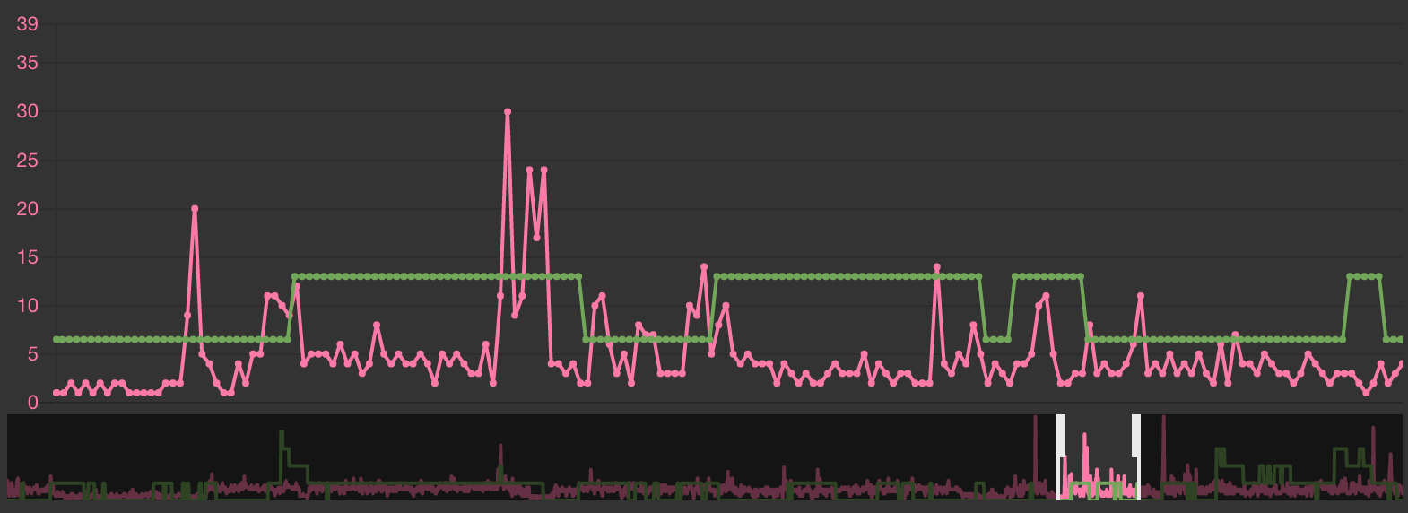
The CPU usage was between 0 and 30 percent.
We hope that this little detail will make charts even more useful to you.

Oliver loves typed languages and fluid user experiences.